Map of My World
Introduction
The "Map of My World" project serves as both an artwork and a conceptual framework applicable to our inhabited spaces. This project explores how we mentally chart our worlds based on the elements we cherish in our surroundings and the positive impact they have on us. By eliciting personal anecdotes from the community regarding their favorite spaces and associated emotions, the project aims to construct a visual representation of the locale, employing colors and shapes that mirror the emotional spectrum and frequency of mentions respectively.
The Why
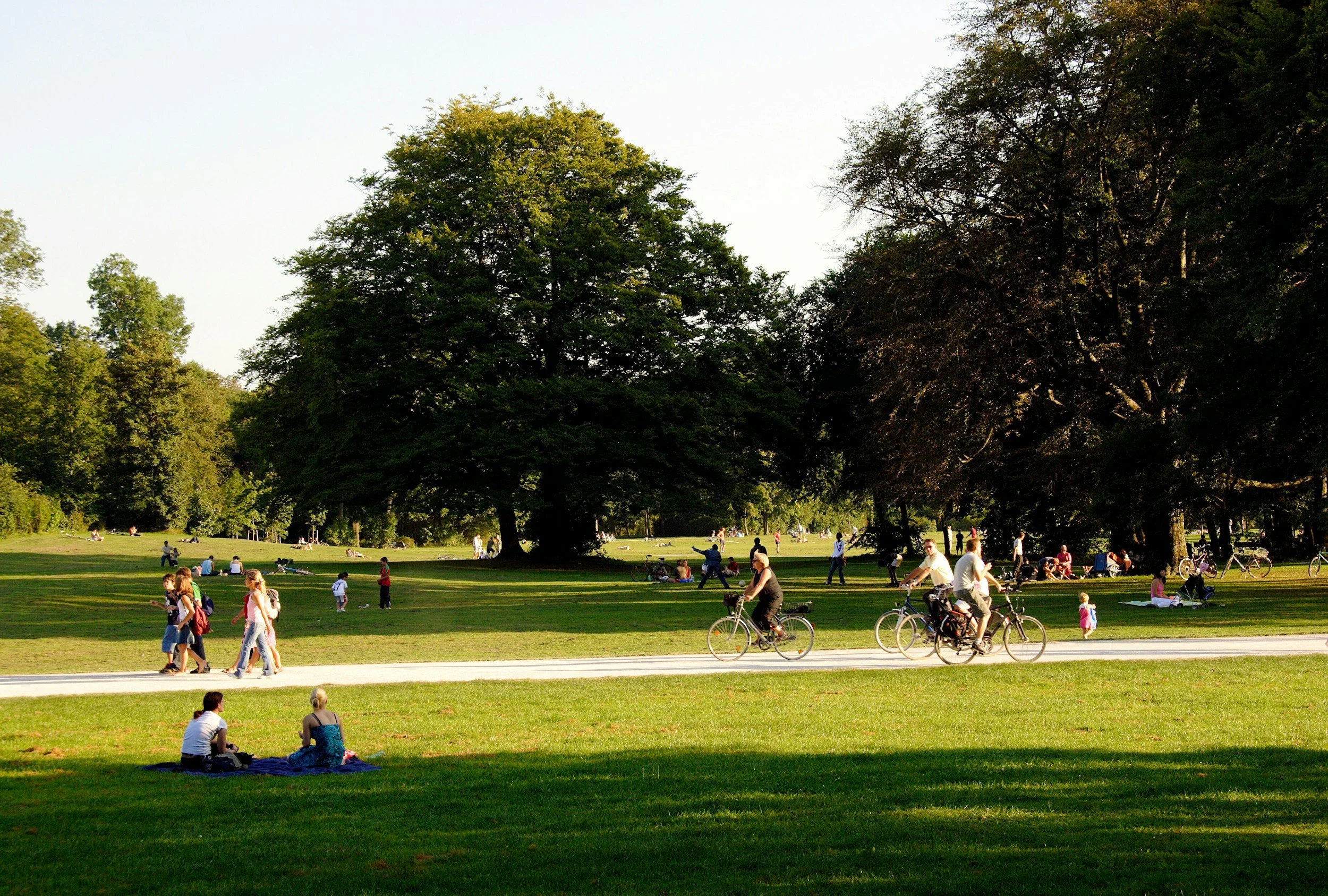
The unseen impact of our environment dwells deep within our mind and body in the form of memory. When we remember a place, we are using the strongest data we recorded through our senses to recreate “the feeling” we had when we were there. Sometimes we are unaware of this record until we are prompted by a life catalyst like moving to a new place, death of a loved one, or having the space limited to us in some way (destruction, obstruction or construction). The information that lies within us springs to life when recalled and renews our love for the space in what it provides and how it supports us.
Urban planners and policy makers require data to support the decisions and policies they are responsible for creating (from the blog post entitled “Why I love, and hate, my work as an urban planner”). Understanding how the built environment connects the inhabitants, where people invest in their health and wellbeing, and where businesses thrive is part of creating a dynamic and effective neighborhood. But the effect of change can be hard to measure, especially when the data points remain in a spreadsheet disconnected from the visual and emotional aspects. How then can the data remain connected in a fashion that creates curiosity and joy?

Urban planning factors (source: walimemon.com)
The How
In a similar way to remembering, we can also recreate “the feeling” of a space with a record of data taken from respondents in a small survey, captured in color and form, interconnected by associations, forming an artistic rendering. The artwork is also a map of the data, corresponding to the geography and arrangement of the area. Each map is different and unique in time and place. Respondent data may change over time as the geography changes too. Captured in the rendering is a conglomerate memory and a way to perceive our urban development in a new context.
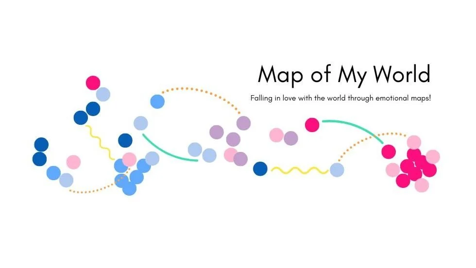
See below the imaginary place called Grover Park. In this example, 41 people replied to the survey with feelings about the space, their favorite area, favorite memory from the park, and how they use the space in their personal lives. The data is collected, assigned to a color associated with the emotion, placed within the geographical area of the person’s favorite place, and connected via a straight, wavy, or dotted line to attribute association.
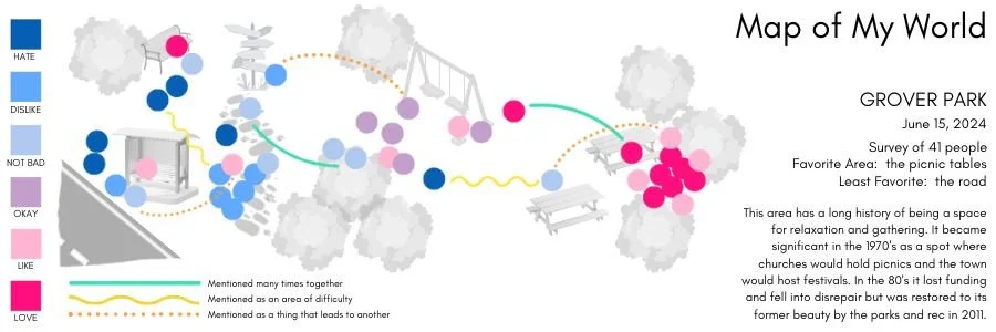
This image shows the data overlaid on a geographical representation of Grover Park. It is both a graph and a map. Important data points like date, # of respondents, and areas of interest are supported by a brief history of the space. The history is there to contextualize the data and give it necessary grounding to balance generational differences and changes in use over time.

Here is a sample survey response.
This respondent was a father who liked bringing his daughter to the park to swing. He has fond memories of standing behind her on the swings to push her. As she has gotten older, he has moved to watching her from the picnic tables and enjoys the shade and social aspects of hanging with the other parents there.
In order to invite participants and the public to become curious and feel joy regarding the survey, the data is then used to create a one-of-a-kind artwork. The collective memories are processed and mapped and the visual representation is cleared of data to reveal the areas of emotional imprint and association. This becomes the physical artwork and the unique expression of the space.

In the above example, we have employed brushstrokes to create the feeling of human touch, but we can also use other shapes or forms as representation of memory like circles, hexagons, rectangles, or other items that may hold some conceptual importance or association with the space or people.

This type of expressionistic analysis leaves room for variations that can create widely dynamic artworks. When paired with a QR code, it can be connected to a landing page that builds a case study, provides historical context, or clarifies a social or political issue. There is also room to expand this project into an AR experience (augmented reality) via a virtual mapping of the data and artwork.
The Result
Several outcomes are possible from this project.
1.
The Individual. First, the participants in the survey would come to understand how the space is being used and what people appreciate about it via the map which every participant would receive in their email. This information could create feelings of neighborhood solidarity, social proof for change, and result in deepening their relationship with the space and the people who use it.

2.
The Urban Planner. Second, urban planners can also use the data to gage the effectiveness of certain strategic changes. Depending on the questions in the survey, they can explore where dangerous or hard to navigate areas exist, how trees and other climate initiatives are helping, and what kinds of things are supporting a sense of wellbeing among community members.

3.
The Community. The last possible result is that the data can be used to create artwork that serves to invoke the expression of a location. Put together with works from other locations, the curated art could be used to create an art exhibition that serves to bring more awareness to a particular part of town, cultural phenomenon, neighborhood interest or developmental investment. This public facing event creates the opportunity for a wider audience to appreciate the built environment, how we use our spaces, and to reflect on how we enjoy and find love within them.
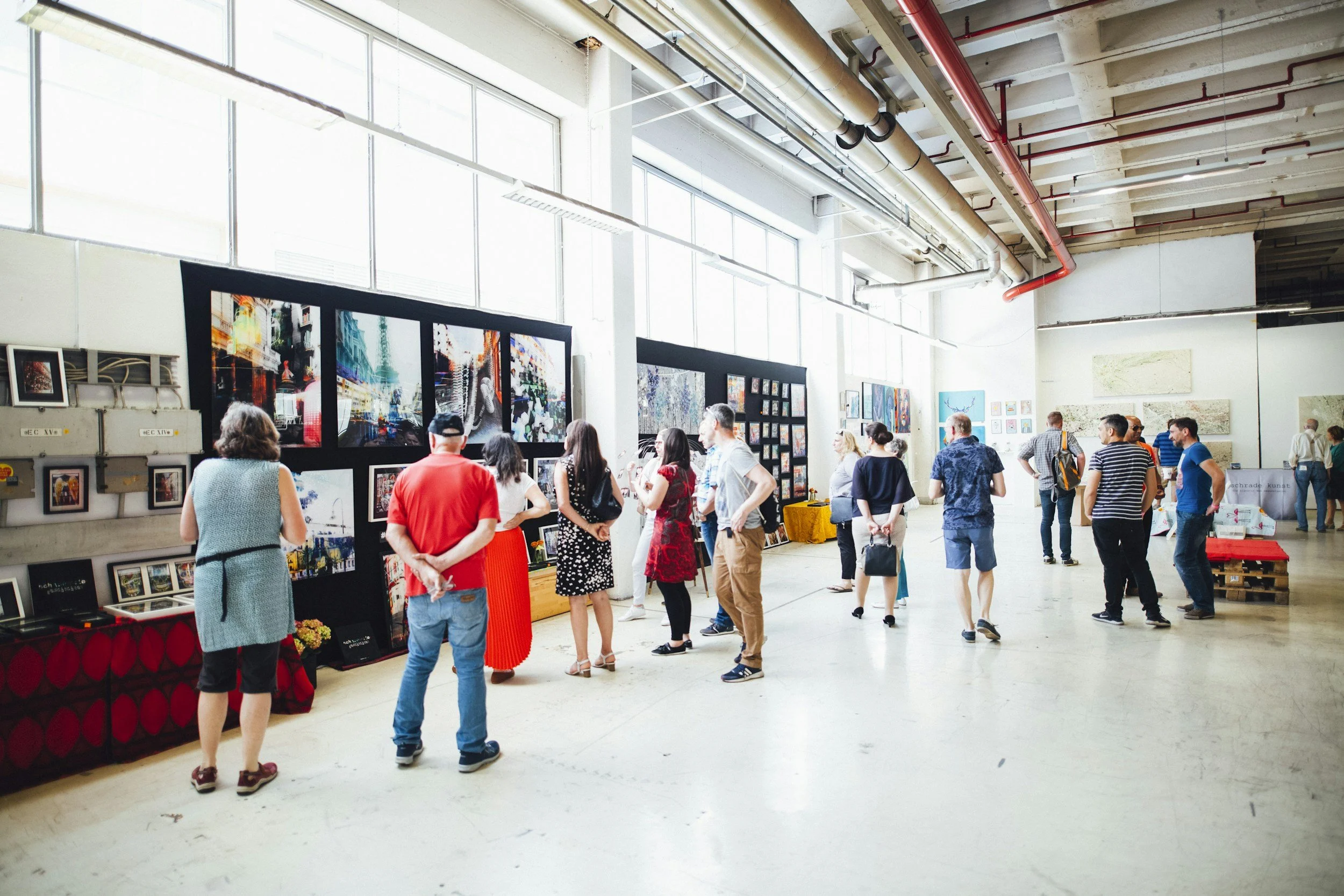
A visual representation of an art exhibition where multiple Map of My World artworks are showcased for the public to learn from, connect with and enjoy.
Artist
Clementine Willowilde